Behind Tezos’ New Look
How the designers approached a shared identity for the ecosystem, the decisions that shaped it, and what comes next.
8 minute read
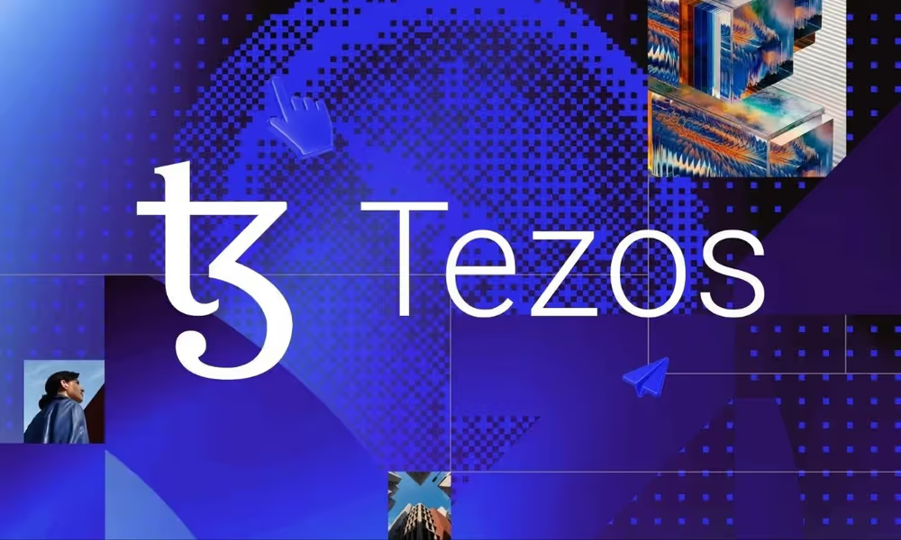
A banner for a community meetup and a website introducing Tezos to a financial institution have very different jobs. So does an artist’s exhibition announcement or a developer’s new app. And yet, they might all want to show that they’re part of the same ecosystem.
That’s one of the challenges behind the refreshed Tezos brand, and you can now see it in action on the new tezos.com, which has just launched, marking the first big public appearance of the new look. Behind it is a whole visual identity and design system that anyone in the ecosystem can use, whether for a single blog image or a full dApp. Some of you might have already caught a short preview of it at TezDev.
In an interview shared with Tezos Commons, Bahador Katouzian and Naomi Strinati from Trilitech, two of the main people behind the refresh, explained why it was needed, how the ideas were narrowed down, what didn’t make the cut and where things go from here. Let’s get into it.
Why a Refresh, and Why Now? #
According to Bahador, part of it was about the brand keeping up with where Tezos is heading. “Our vision for Tezos and its technology is forward-thinking,” he said, and the team wanted the identity to reflect that.
Part of it was also simply about how websites grow. Over the years, many different people and teams contributed to tezos.com, each looking after different pages, and as you’d expect, small differences in design, content and imagery added up. Over time, the site felt less like one place and more like a collection of pages, and the refresh was a chance to bring it all back under one look.
Naomi saw it from the design side too. When creating a blog image or any other visual, the team often found that the existing guidelines didn’t give them a clear enough direction for imagery, so this time they wanted to be much more specific, from technical illustrations to more personal, human imagery.
And then there’s everyone else building on Tezos. If someone builds a microsite, a dApp or any other product, Bahador wants them to have a visual language and design system ready to use, so things feel consistent not just internally, but across the wider ecosystem. That’s why the new guidelines come with more freedom and more structure at the same time, so people can put their own spin on the identity and still have it feel like part of the same family.
A Logo Broken Into a Grid #
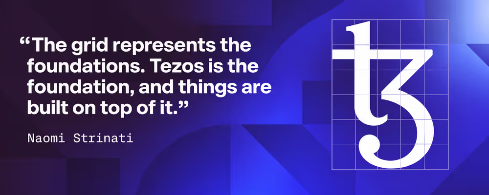
The website is where most people will notice it first, but calling this a website redesign would be selling it short. The idea that holds it all together is the pattern you’ll see across the new site. It’s the Tezos logo cut up along a grid, broken into its parts and put back together into something new.
Naomi said that when she first saw the concept, “it just clicked.” Designers use grids all the time, but normally they stay invisible. Here, the underlying structure is on show on purpose, and it carries a meaning.
If you think about it, that’s pretty much how the ecosystem works too. People take the same foundations and build their own things on them, and Bahador sees the new identity in the same way, as lots of individual parts coming together to form something unified.
It’s also a very practical system. Alongside the pattern, the identity now includes flat and isometric illustrations and different imagery styles, all with rules on how to use them. Bahador summed it up nicely: “Flexibility within guardrails. A unified identity that still has the freedom to adapt. That’s quite a Tezos story in itself!”
From 30 Ideas Down to One #
Getting there took a while. The team started with workshops and interviews, asking people not just what the brand should look like but what Tezos should stand for. They also looked at what other brands were doing and brought in freelancers for an outside perspective. At one point they had around 30 different concepts, which they narrowed down to three strong directions and reviewed those with stakeholders before picking the final one. “The hardest part can be editing those down,” Naomi admitted. “You become attached to ideas, but you have to decide which ones have the depth to work as a complete identity.”
Some ideas made it further than others. For a while, the identity had glossy, glass-like 3D elements, but the team felt they were a bit too trendy. One of the goals was to make the identity relatively future-proof, and something that could look dated within a year or two didn’t fit, so they were stripped back. The dotted, almost pixelated imagery, on the other hand, was rescued from a concept that didn’t make it. People liked it, it worked when tested, and it fit the main idea of many small elements forming a bigger picture.
The Tezos wordmark itself also went through an experiment. The team tried a little thicker lettering, which actually seemed to work well at smaller sizes, but something didn’t feel right and they went back to the original. Sometimes the best part of a refresh is knowing what to leave alone.
Confident, Established and a Bit More Human #
Tezos speaks to a lot of different people, so the question of who the brand was for came up early. Naomi said there was a clear wish for it to feel a little more institutional, without leaving out the art world, developers and builders. One word kept coming up in their discussions and that word is confidence. “Tezos has been around for a long time. It has a history, and it’s been through a lot,” she added. “We wanted the brand to reflect that experience.”
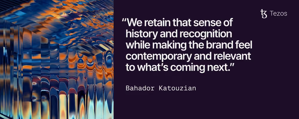
For Bahador, the tricky part was making the brand feel current while keeping its roots. The Tezos logo has a classic feel to it, “almost like a musical treble clef,” as he put it, and that’s something the team wanted to hold on to.
Another big change you’ll probably notice is the photography, much of which was created with AI. Naomi openly called the move to photography “quite a controversial decision,” but explained that abstract illustrations alone couldn’t really show things like community or real-world uses of the technology, and photos bring in the human side.
Going with AI meant they could put together a big, consistent set of images without flying photographers around the world, though it wasn’t quick. They generated each image around 50 times, following a set direction for lighting, colour and composition. In her words, “AI helped us make the images, but the judgement came from the people working on them.” The library is also meant as a style reference for anyone in the ecosystem, whether they use AI or take their own photos.
Built to Be Built On #
This version of the website introduces the new brand foundations rather than pushing it as far as it could go. According to Bahador, that was deliberate, since the move from the old site to the new one had to be coherent. The site feels quite institutional for now, which is fine at this stage, but there’s room for much more.
The next step is working with the product designers to make the experience richer for different audiences, from institutions to developers. There’s also Tezos X to think about. As it rolls out, the team is working on how the different microsites and products currently tied to Etherlink will come together under the same experience.
And maybe the most important part for the community is that the design system is open to everyone. The assets and guidelines are already up on the new website, and the team wants to keep making them easier to use, because if someone in the ecosystem wants to create something, “they shouldn’t feel blocked by design,” as Bahador put it. Tezos has always had a very creative community, and now it has a toolkit to match (we already have a couple of ideas for our own Tezos Commons visuals as well).
A lot of work went into building this toolkit, and it’s now open to all of us. So go check out the brand section on the new tezos.com, grab the guidelines and kits, start using them and make them your own.